Hands on with the iPhone 6 and iPhone 6 Plus
by Joshua Ho on September 9, 2014 7:15 PM EST- Posted in
- Smartphones
- Apple
- Mobile
- iPhone 6
- iPhone 6 Plus
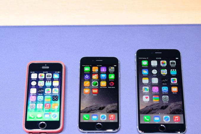
When it comes to the iPhone 6, one of the most immediate impressions will definitely be the industrial and material design. Going back to the launch of the original iPhone 5 one of the immediate impressions that we had was that the iPhone 5 felt incredibly light and thin. If nothing else, the same is true of the iPhone 6.
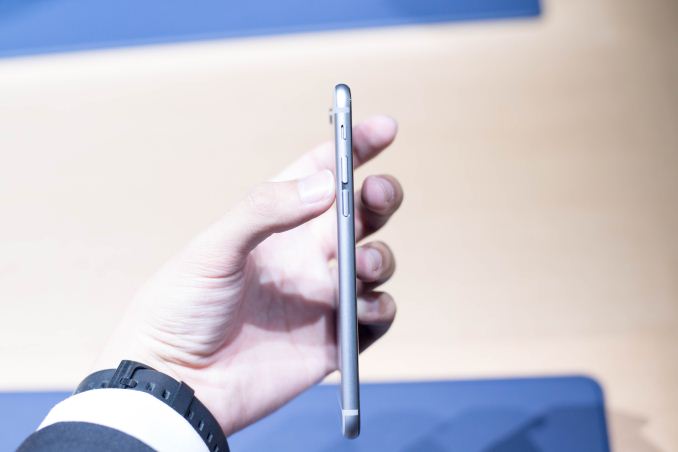
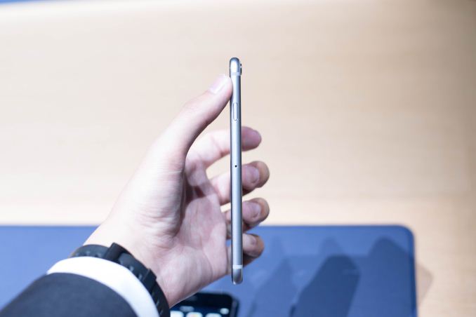
While the new iPhone 6 isn’t lighter than the iPhone 5, it feels incredibly thin compared to the iPhone 5s I had on hand for comparisons. In fact, the iPhone 6 feels a lot like the HTC 8X in terms of the thickness of the edge, but without the strongly sloped back to increase the size of the phone in the hand.
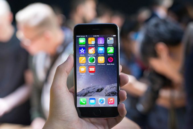
The size itself is also a key feature, and as I suspected the iPhone 6 feels very much like the One (M7) in size, which I still find to be a great fit and easily used with one hand. While it’s definitely possible for the iPhone 6 to be a bit bigger without being impossible to reasonably use with one hand, it manages to hit a good balance between ease of use with one hand and display size for media consumption.
Of course, the iPhone 6 Plus isn’t really easy to use with one hand, as just the 77.8mm width makes it difficult to reach across the display horizontally, much less from diagonally. It is definitely easy to hold with one hand though, and the rounded display feels great.
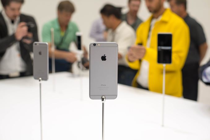
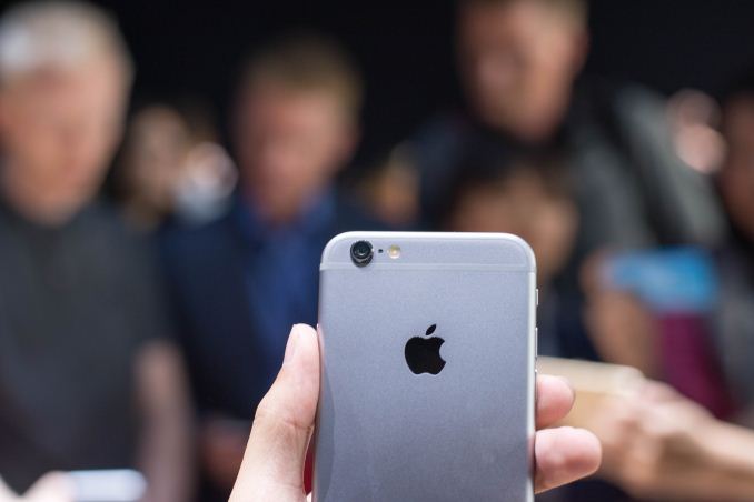
In terms of the design of the device, it’s clear that Apple had to break some trends that seemed to be present in previous iPhones. For one, the noticeable camera bump came from a need to maintain and/or improve camera quality while simultaneously driving down z-height overall, so there seems to have been an industrial design trade-off here for the sake of functionality. There’s also the relatively thick plastic lines which are a departure from previous designs but seem to be necessary for NFC capabilities. I’m personally unsure how I feel on these two design elements, but they may be an issue for some.
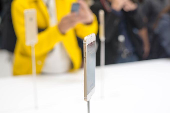
Looking past the size of the iPhone 6, there are a lot of noticeable subtle changes to the device compared to the iPhone 5s. In terms of low-hanging fruit, the side-mounted power button definitely helps with keeping a firm grip while turning on the phone, and I didn’t find any real issues when trying to turn the phone on or off. The slightly curved glass that helps to make for a smooth transition when swiping off the edge of the display is also a nice touch, although I’m concerned about the implications that this has for drop resilience and screen protectors. This is mostly based upon my past experience with such 2.5D displays, as traditional PET screen protectors generally don’t adhere properly to curved surfaces and Android phones with this type of cover glass tended to suffer from shattered displays more readily.
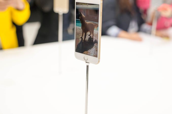
There are some changes that are subtle enough that I’m not sure if this is a product of production variance. In the iPhone 6 and 6 Plus that I tried, I noticed that the home button seemed to be closer to the display when compared to the iPhone 5s, and that the feel of the button was a bit more positive, although the click is still relatively subdued compared to the volume and power buttons.
One of the highlight features of the iPhone 6 Plus is optical image stabilization, but it appears that it doesn’t run during preview so it was hard to see just how much accommodation the system has and how it works. Although the announcement seemed to suggest that the module moves vertically and horizontally, it seems more likely that we’re looking at a VCM that shifts the lenses around to compensate for horizontal and vertical motion.
Overall, it was rather hard to really notice any difference in responsiveness as the iPhone 5s almost never stuttered or hesitated in my experience. The iPhone 6 similarly had no such issues when casually trying various features but a full review may show that this changes when used in real world situations.
Unfortunately, many of the features that Apple has implemented in this latest iteration seem to follow the same pattern as they aren’t easily demonstrated. For example, seeing exactly what Apple means by dual domain pixels effectively requires a microscope to clearly see what Apple is talking about, and really seeing a difference in color shifting, along with improved maximum contrast requires a dark room with little stray light.




32 Comments
View All Comments
Drumsticks - Tuesday, September 9, 2014 - link
Thanks for the hands on. It'll be nice to see the review - this version of the iPhone seems to have a lot less fanfare than I expected. I'm hoping you get some nice details on the A8 SoC, I'd love to hear more about that.Also, is anybody reminded of the Lumia 925? Minus the camera bump of course, but I swear they look similar in my head. I think it's the sides...
jimbo2779 - Tuesday, September 9, 2014 - link
I had to get mine out to take a look as I thought it resembled the 925. On closer inspection it is like a mix of the 925 and the M8 (with its plastic lines on the back).Its crazy how little fanfare this launch is getting compared to last years iPhone 5s. I think Apple have missed a few beats with this launch and it is seeming to be underwhelming on quite a few fronts.
boozed - Tuesday, September 9, 2014 - link
Wow, 77.8 mm is pretty thick!And what the hell is "2.5D"?
mkozakewich - Wednesday, September 10, 2014 - link
Think of leaves of green-leaf lettuce. The leaves are ostensibly a thin plane, which can be thought of as 2D, but the plane itself is larger in some places (towards the outer edge) than others. This doesn't seem to make sense, until you look at it in 3D space and see that the 2D surface is following a curve.In other words, any plane that follows a curve is 2.5D.
craighamilton - Saturday, December 6, 2014 - link
This day...Apple products are not very popular anymore if you look at consumer based reviews (such as http://www.topreport.org/phones/ for example...)kasziel - Thursday, September 11, 2014 - link
thats the width not the thicknessFleeb - Tuesday, September 9, 2014 - link
"so there seems to have been an industrial design trade-off here for the sake of functionality"Apple? Really?
Spunjji - Thursday, September 11, 2014 - link
Another way to look at it is that there was absolutely no reason to make the phone thinner (and thus create a camera bump) besides a weird fetishism for slender devices, so in that light it's actually very Apple indeed.makip - Friday, September 12, 2014 - link
No that's not the case, as thinner devices of this size are easier to hold.dishayu - Wednesday, September 10, 2014 - link
Is it just me that thinks that Apple has "borrowed" a lot of design language from HTC's M7 and M8 phones?