HTC Surround Review: A Pocket Boombox
by Brian Klug on November 13, 2010 2:01 AM EST- Posted in
- Smartphones
- Windows Phone 7
- HTC Surround
- Mobile
Even though the WP7 official unveiling is quite a ways behind us, we’ve been spending quite a lot of time with the respective Windows Phone 7 launch devices. Anand has the LG Optimus 7 and the Samsung Focus, and I got the HTC Surround. There are a number of other devices bound for other carriers both international and domestic, and we’re getting to them in time.
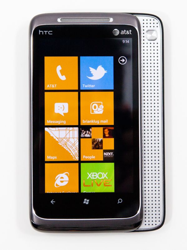
If you read the launch piece, you probably know most of what there is to say about the HTC Surround aesthetics wise. First off, the Surround shares a lot of design cues with a number of other HTC devices - it’s got the off-grey metal from the Nexus One, the trim and speaker grating from the Desire, and some subtle cues from other HTC phones as well. Suffice to say, it’s an attractive piece of hardware in general despite being an obvious amalgam of design language from all over HTC’s device lineup.
What’s most striking about the Surround is how HTC has chosen to differentiate the hardware. The Surround - true to its namesake - has a slide out speaker that runs along the side of the handset, for emulated surround sound. The speaker assembly doesn’t slide out much more than a centimeter, but still results in the same added thickness you’d get with a landscape keyboard.
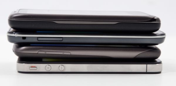
Compared with other smartphones, the Surround is definitely hefty.
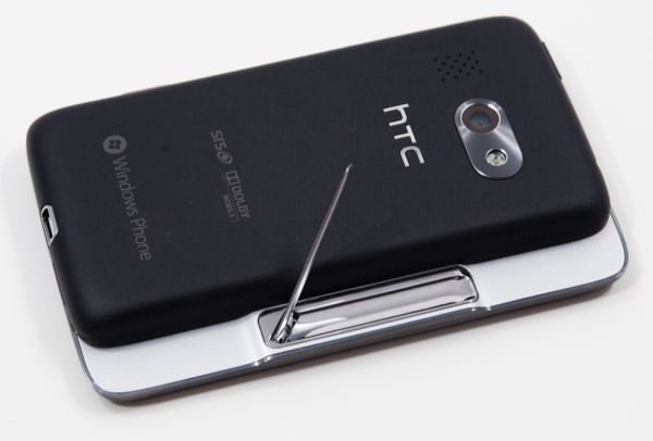
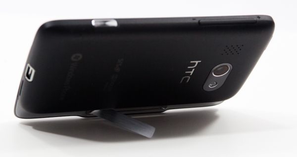
On the other side of the Surround’s slider is an added bonus - a kickstand. The metal strip is held in place with a magnet, and pops out with a quick flick of the fingernail.
The kickstand is spring loaded to keep the arm in proper position, but ultimately works in a very different way than the EVO’s. Where the EVO’s kickstand is somewhat like a table leg at 45 degrees, the Surround’s is more like an arm that sweeps out at the base. It works just as well, but puzzles for a second if you’re used to using the EVO kickstand since it operates so differently.
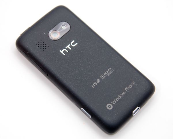
The back of the Surround is somewhat interesting. It’s a black soft touch material, but embedded in the material are tiny reflective metallic flecks. It manages to be unlike any other device I’ve handled, yet not tacky like a back adorned with glitter would be. The soft touch material feel itself is unchanged. It’s an interesting look that manages to be different, yet not gaudy. In some light, the back looks completely matte black, yet in other light, the flecks are instantly noticeable. It’s a matter of taste, but honestly I think the back looks unique.
Where the Surround is different is the SRS and Dolby mobile branding square in the middle of the back. Up at the top is the camera and LED flash, and a grating to the left. The chrome region around the camera is raised slightly, protecting the camera from being scratched on a flat surface, but unfortunately the metal itself is ridged circularly and thus will show wear.
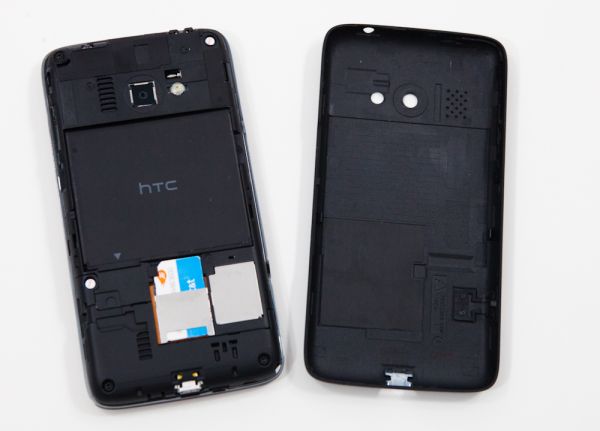
Popping the back off the Surround is interesting - there’s a depression near the microphone port at the bottom you slide your thumbnail into and pry the back of the case off with. What’s different about the back is that the buttons are integrated into the back of the case which peels off. All three buttons - the right side volume rocker and camera button, and the top power button. The buttons press on small buttons integrated into the main body.
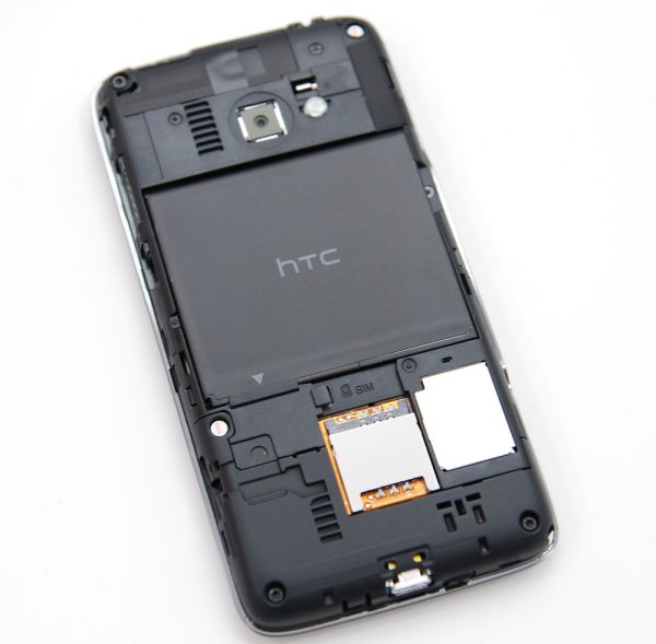
With the back side off, there’s a lot underneath. At the top is the camera which again shoots through a piece of plastic on the cover. The way this sensor is packaged appears very similar to the Nexus One. The LED illuminator off to the right ironically doesn’t have a layer of plastic. What’s curious is just above it - the vibration mechanism, which is exposed.
This is the first time I’ve seen a phone’s vibration module completely exposed. The counterweight visibly spins around inside its chamber if you trigger vibration with the back popped off. Interestingly enough, there’s a detent on the case corresponding to this open notch.
Popping out the battery doesn’t reveal a lot underneath, but you need to do so to slide the SIM out, which is standard fare. What’s interesting is that to the right of the SIM slot is a strange metal cover. I’d say that if there was an internal microSD card in the HTC Surround, it’s probably under here... More on that later. Even though there are gratings on the back of the device, none of them appear to actually be grilles for sound. It’s deceptive since there’s also that unexplained grille on the plastic case that ordinarily would be where you expect the speaker to be.
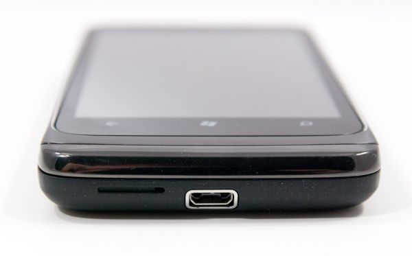
The rest of the HTC Surround is pretty self-explanatory, but if you want to check out each side of the device, there are photos in the gallery below.
Last but not least is packaging. The Surround has a decently sized yet somewhat boring box on the outside. Open it up, however, and you get a face full of bright orange. There’s the usual assortment of texting and driving warnings and stickers, but you’re presented with the phone immediately. Down below are the accessories and manuals. The Surround comes with a pair of earbuds with three playback button controls (which appear to be identical to those that came with the Nexus One and other HTC devices), a USB cable, and charger. You can check out the gallery for unboxing.
For full specifications, check out the table below:
| Physical Comparison | |||||||||
| Apple iPhone 4 | Motorola Droid 2 | Samsung Galaxy S Fascinate | Samsung Focus | HTC Surround | |||||
| Height | 115.2 mm (4.5") | 116.3 mm (4.6") | 106.17 mm (4.18") | 122.9 mm (4.84") | 119.7 mm (4.71") | ||||
| Width | 58.6 mm (2.31") | 60.5 mm (2.4") | 63.5 mm (2.5") | 65 mm (2.56") | 61.5 mm (2.42") | ||||
| Depth | 9.3 mm ( 0.37") | 13.7 mm (0.54") | 9.91 mm (0.39") | 9.9 mm (0.39") | 12.97 mm (0.51") | ||||
| Weight | 137 g (4.8 oz) | 169 g (5.9 oz) | 127 grams (4.5 oz) | 119 grams (4.2 oz) | 165 grams (5.82 oz) | ||||
| CPU | Apple A4 @ ~800MHz | Texas Instruments OMAP 3630 @ 1 GHz | 1 GHz Samsung Hummingbird | 1 GHz Qualcomm QSD8250 | 1 GHz Qualcomm QSD8250 | ||||
| GPU | PowerVR SGX 535 | PowerVR SGX 530 | PowerVR SGX 540 | Adreno 200 | Adreno 200 | ||||
| RAM | 512MB LPDDR1 (?) | 512 MB LPDDR1 | 512 MB LPDDR1 | 512 MB LPDDR1 (?) | 512 MB LPDDR1 (448 system, 64 GPU) | ||||
| NAND | 16GB or 32GB integrated | 8 GB integrated, preinstalled 8 GB microSD | 2 GB, 16 GB microSD (Class 2) | 8 GB integrated | 512 MB integrated, 16 GB (Internal Class 4 microSD) | ||||
| Camera | 5MP with LED Flash + Front Facing Camera | 5 MP with dual LED flash and autofocus | 5 MP with auto focus and LED flash | 5 MP with autofocus, LED flash, 720P video recording | 5 MP with autofocus, LED flash, 720P video recording | ||||
| Screen | 3.5" 640 x 960 LED backlit LCD | 3.7" 854 x 480 | 4" Super AMOLED 800 x 480 | AMOLED 800 x 480 4" | 3.8" LCD 800 x 480 | ||||
| Battery | Integrated 5.254Whr | Removable 5.2 Whr | Removable 5.55 Whr | Removable 5.55 Whr | Removable 4.55 Whr | ||||




39 Comments
View All Comments
KayDat - Saturday, November 13, 2010 - link
Would have been interesting if HTC could implement a keyboard/speaker combo. Slide one way for speaker, other way for keyboard. That way, you wouldn't add thickness just for speakers.bpt8056 - Saturday, November 13, 2010 - link
I like your idea about the speaker/keyboard combo. In addition to that, better landscape support would make this phone a much more competing product.vol7ron - Sunday, November 14, 2010 - link
I love the fact that speakers/sound quality are now being considered by manufacturers. I wish the kickstand was on it, so the screen was higher.I'm curious how big the speakers are - I also would not be too sure that the part would be durable enough to withstand a slide out keyboard/speaker combo.
Randomblame - Saturday, November 13, 2010 - link
if only it ran windows mobile 6.5 and that slide out was a keyboard. That would be the updated rhodium aka touch pro 3 I would buy.Snotling - Saturday, November 13, 2010 - link
come on now... win mobile? What else Windows XP forever? Do you Miss Pentium CPUs? Still playing Starcraft 1?aebiv - Monday, November 15, 2010 - link
No, some of us aren't wow'd by the fact with WP7 you LOSE functionality vs WM6.5.Quit being a tool.
Nataku - Monday, November 15, 2010 - link
well... legacy is a blessing and a curse, thats all that can be said for winmo6.5...im actually glad win phone 7 gets a fresh start, at least nothing to drag it's feet
a12e - Saturday, November 13, 2010 - link
only has 8 GB of integrated NAND, I believe, not 16.softdrinkviking - Saturday, November 13, 2010 - link
i can't find that mistake. on pg 2, it says 512MB of integrated NAND, and a 16GB microSD card.a12e - Saturday, November 13, 2010 - link
In the spec comparison table at the bottom of the first page for the Samsung Focus.I wish it had 16GB... then I'd have an extra 8GB right now. :)