The Sprint HTC EVO 4G Review
by Anand Lal Shimpi on June 28, 2010 6:04 PM ESTThe Basics
The EVO 4G currently ships with Android 2.1, although sometime before the end of the year it should get 2.2. Layered on top of Android is a set of HTC developed apps, widgets and UI modifications called Sense. As a whole HTC’s Sense makes Android a much more polished experience and is generally a positive thing. The downside is that it takes HTC longer to bring Android updates to its phones as it has to not only port the updated Android code but also make sure that Sense works with it as well. I’ve already looked at Sense in my Incredible review and talked about Android in my Nexus One review. What follows here is a brief refresher as well as an update on some things I didn’t touch last time around.
The lock screen is different but no better or worse than what I’ve seen on other Android phones like the Nexus One. Instead of swiping left to unlock, you swipe down. If your phone is locked and you get a call you just swipe down to answer and swipe up to decline.
When locked any incoming text messages appear with a preview at the bottom of the screen. This is in addition to the usual notifications up top which I’m happy to say I’ve finally gotten used to and definitely appreciate above and beyond what Apple does in iOS. I still have a fondness for webOS’ notification system but until we see a resurgence of Palm under HP management I’ll have to count them out of the smartphone wars.
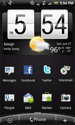
The main home screen has a calendar/weather widget and icons for Messages, People (Contacts), Mail, the Android Market, the Camera and Voicemail. You can add your own icons by hitting the menu button and selecting the Add to Home option.

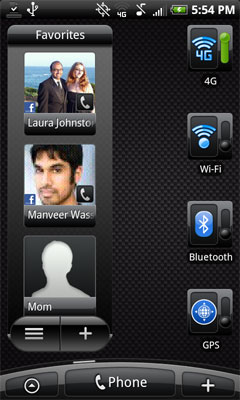
There are a total of 7 home screens that you can configure on the phone. Three to the left and three to the right of the main screen I just described. The default EVO 4G skin has a page with an MP3 player widget as well as a bunch of Sprint apps, a page with a Bookmarks widget for frequently accessed websites and one more with a Friend Stream widget that combines your Facebook and Twitter updates into a single stream of other peoples’ lives. The other three home screens include a calendar, Google search bar and widgets to turn off things like 4G, WiFi, Bluetooth and GPS.

The quick access to turning off 4G and WiFi is pretty nice, although in practice the 4G toggle didn’t get as much use as I thought it would.
The favorites widget automatically populates itself with frequently dialed contacts. If you supply your Facebook login information it will also indicate if your contact has updated their Facebook page. Unfortunately trying to view a Facebook profile from a contact’s info page won’t launch Facebook’s Android app but instead just load the mobile version of Facebook in the browser.
Cloud Integration
Like all other Android devices, the EVO 4G integrates with the cloud very well assuming you actively use a couple of key services: Google apps and Facebook. If you supply your login information to those services (you can also add Flickr and Twitter) pretty much every aspect of your phone will automatically integrate itself into your life before you can even think of the word sync.
Contacts will automatically get pulled from your Google contacts and Facebook friends list. Email addresses, phone numbers, addresses, photos, everything all get integrated onto your phone. If anyone changes their contact information in Facebook it’ll get updated on your phone. If you update a contact in Google the same will happen on your phone. It’s very nice. If you don’t use those services then the EVO works more like a regular phone but without good supplied desktop sync software.
The cloud integration is ridiculously convenient. It’s useful enough that it makes going to most other devices feel ancient. Even if you don’t have your life in the cloud, stepping foot into the Android world is generally enough to make you want to change.
Organization by Person
Once you’re all synced up with the cloud Android truly behaves like a Google product: it just works on organizing data. Here are all of the things you can do when you’re looking at a single contact on the EVO 4G (or any other HTC Sense enabled device):
- View Contact Information including available personal information from Facebook
- View all SMSes exchanged with the contact
- View all emails exchanged with the contact
- View latest Facebook and Flickr updates and albums
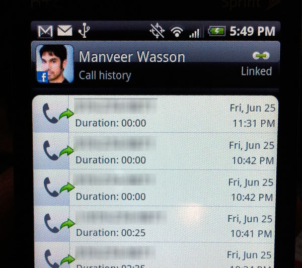
- View a log of all calls between you and the contact (you can also clear the call log history)
The functionality itself is above and beyond anything Apple offers, but it gets better. There’s full customization available on anything I mentioned above.
Want to see only the past day worth of Facebook updates for the contact? That’s configurable. Want to see the past 30 days of Facebook updates? You can set that as well, all on a contact by contact basis.

You can also do typical cellphone stuff to each contact. You can opt to send the contact straight to voicemail whenever they call or choose specific ringtones. Linking a contact to their Facebook profile is particularly helpful since we’re vain creatures and tend to share our birthdate with our FB friends. You now have a quick way of figuring out when someone’s birthday is just by pulling up the contacts in your phone.
If this all sounds like stuff you’d never want to deal with, you don’t have to. The EVO 4G still works like a normal smartphone. The flexibility is simply a selling point of Android.


97 Comments
View All Comments
DaveGirard - Monday, June 28, 2010 - link
you're missing the iPhone 4 in the battery life and there is only one phone in the H.264 page.And I think you need to set your white point properly for the iPhone 4 pics. Saying that's the best picture you can produce is not accurate.
Anand Lal Shimpi - Monday, June 28, 2010 - link
The iPhone 4 review is next, and the white balance was actually a problem for the iPhone 4 - regardless of where I tapped to sample the white balance pretty much came out that way.More on this tomorrow...
Take care,
Anand
SandmanWN - Monday, June 28, 2010 - link
"The size of the screen is really what sets the EVO 4G apart from the competition, and honestly I couldn’t think of a better phone for browsing the web. Loading full websites is a pleasure and the screen is large enough where you can actually read a lot of content, even while zoomed in. I’d be willing to go as far as to say that it is almost too small for the ideal web browsing experience."This whole paragraph is confusing and contradicting. You say you couldn't think of a better phone for web browsing. Then say you you can read a lot even while zoomed in, which I think you meant to say out there. Then you contradict the first sentence and say it is almost too small for web browsing.
I think that paragraph needs a mulligan.
Anand Lal Shimpi - Monday, June 28, 2010 - link
I've cleared it up a bit :)tipoo - Monday, June 28, 2010 - link
It would be great if you could include Evo 4G benchies in the iPhone 4 review.rf40928 - Friday, July 2, 2010 - link
Yeah, I guess u saw the Evo benchmarks.I have an Evo and Im considering a Iphone 4 ( my cousin got one )..
I posted above the following: ... funny how the Iphone 4 review that Anand did proves Iphone 4 on a "slower" 3g network is consistantly faster then the Evo on a 4G network when it comes to the web .. I guess 4G's Peak performance is theoretically better.. but are Sprints 4G average 4g Speed numbers better then ATT's avg 3g speeds?? ..it would seem not.."
yibrushn - Monday, June 28, 2010 - link
Sorry just gotta make 2 corrections. The front camera is 1.3 mp and the screen is TFT not AMOLED.Anand Lal Shimpi - Monday, June 28, 2010 - link
Fixed and fixed :)Hmm that was actually a bit confusing, Sprint lists it as an OLED screen and it is very similar to the OLEDs we've used in terms of color calibration but all the data I can find points to a TFT display.
DigitalFreak - Monday, June 28, 2010 - link
I thought the screen thing might have been a typo, until I saw there was an entire paragraph describing the "AMOLED" screen. :-/Anand Lal Shimpi - Monday, June 28, 2010 - link
That was absolutely my bad. HTC appears to have calibrated the screen to mimic the other OLEDs, it's overly red. Combine that with the OLED listing here http://shopamerica.htc.com/cell-phones/productdeta... and it resulted in my mistake. I was wondering why viewing angle was so bad for OLED, I should've been more careful in my research there instead of just making an assumption. I will be more careful in the future.Thanks again for catching the error early on.
Take care,
Anand