Palm WebOS, Pre and Pixi – Where Are We Now?
by Joseph Berthiaume on March 23, 2010 12:00 AM EST- Posted in
- Smartphones
- Mobile
Pre evolves
The Pre’s biggest shortcoming is in the build quality of the hardware and this is the spot where the iPhone noticeably trounces it. The iPhone just feels indestructible, which is pretty amazing for a device with such a huge screen. It is Pre’s slider design that hurts it the most. The plastic-on-plastic mechanism just isn’t all too smooth and that little bit of grinding sound is enough to make the phone feel a little cheap. You never get that impression with the iPhone or any Blackberry. It may be the nature of the beast when it comes to the hardware from a design standpoint. To keep the device to a reasonable size, yet maintain the size of the LCD, Palm had to hide the keyboard as they did. Of course they could have chosen a smaller screen, and leave the keyboard always exposed – which brings us to Palm’s second WebOS device – Pixi.
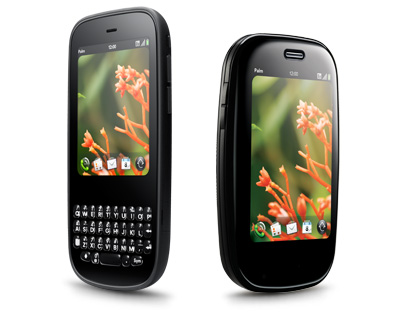
When it was first released in November 2009, it seemed as if the Pixi was being steered into the lower-end smartphone market, perhaps as a ‘starter smartphone,’ to those coming from what’s become known as a ‘feature phone’. Pixi’s price certainly confirmed that, at 99$ to start, and it’s even cheaper now, if not free (with a contract, of course). What’s interesting, though, if looked at from a bit of a higher level, is that Pixi actually exceeds its ‘big brother’ Pre in some areas, despite its diminutive stature.
Pixi – Small, Solid and Still Smart
It’s easy to say that the name “Pixi” doesn’t exactly conjure up images of a tough, fully-featured mobile device that’s meant to centralize your on-the-go experience. Truth be told, the name “Pixi” does sound a little…wimpy. While there is some truth to that perception as we’ll see later, there are some interesting things going on here.
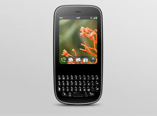
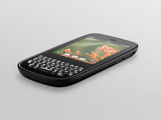
As you can see, Palm chose a radically different form factor from its first WebOS device. With Pixi, Palm has brought back memories of the Treos and Centros of years past. In eschewing the slider mechanism of the Pre, Palm has eliminated what was, without a doubt, Pre’s biggest shortcoming. Gone is the grinding plastic-on-plastic mechanics used to expose the keyboard. Oreo-twist effect? Forget it. There are no physical bits here to ruin the experience or distract from the excellence that is WebOS, just a monolithic chunk of plastic that feels very, well, iPhone like. It’s solid-feeling, as if you could drop it and it wouldn’t shatter into 300 pieces (which is exactly the feeling you get when holding the Pre).
Now, in order to get to this more appealing (to some) design, Palm had to make some interesting and likely very difficult, choices. Not wanting to give up on the hardware keyboard (which seems to be their thing), Palm chose to make it an always-exposed type. Think Treo, Centro, or Blackberry. In order to fit that in, they had to make the difficult decision of altering what was one of Pre’s strong points – the screen. While the Pixi’s screen doesn’t lose too much of the splendor that was the Pre’s, it does lose significant size and some resolution:
| Overall Size | Screen Size | Screen Resolution | |
| Apple iPhone 3GS | 4.5" x 2.4" x 0.48" - 4.8oz | 3.5" | 480 x 320 |
| Palm Pre | 3.9" x 2.3" x 0.67" - 4.76oz | 3.1" | 480 x 320 |
| Palm Pixi | 4.37" x 2.17" x 0.43" - 3.2oz | 2.6" | 400 x 320 |
Palm also seems to have found some cost savings with the Pixi backlight. It’s not dim by any stretch, but if compared with the Pre (which might not be fair), it’s not as bright. This is probably more of a compliment to Pre’s screen than anything else, but needs mentioning if you are coming from the Pre. That all being send, Pixi’s screen is still outstanding – one of the best around.
Brief side track - this brings up an interesting question: what’s the most desirable form factor here? The answer is… there may not be an answer. If you ask Apple, a hardware keyboard is oh-so-1990’s. Palm seems to be in the same camp as RIM in that hardware keyboards are the way to go. Android seems to be leaning towards software side of things and the newly announced Windows Phone 7 will support both paradigms. There are those who believe that the industry as a whole is moving towards devices with big screens and software keyboards. The one-device-to-rule-them-all camp is in that group when you consider that these phones are also fully featured media players that can store video, access YouTube etc. On the other hand, who can argue with the millions of corporate Blackberry carriers who depend on their hardware keyboard to rip off dozens of emails per day? Perhaps this is another area where there is room for more than one, or even several, form factors and designs.
Beyond the changes to the screen, it’s obvious that the Pixi was designed with the Pre’s shortcomings in mind. Palm clearly learned something from the Pre and how it was received. For example, the default back panel of the Pixi is textured like the Pre’s Touchstone back (though the default Pixi panel is not a Touchstone panel – that costs extra - *mutter*). Also, regarding the Touchstone – the Pixi sticks to it much stronger than the Pre. It might not sound like much, but if you’ve ever tossed the Pre on the Touchstone and had it slide off and not charge for a whole night (as I have, more than once) you’ll appreciate this. The microUSB port door on the Pixi isn’t a nightmare as on the Pre. You actually don’t need a micro-crowbar to get it open.
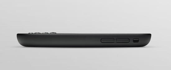
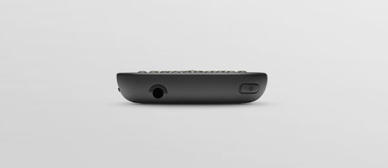
Pixi also moves a few buttons around slightly. The power switch is on the opposite corner from the Pre’s and the volume buttons have moved from left to right. Palm’s famous silencer switch has a different form and a slightly different position. It also feels a little more solid, which if you’ve read this far, you will recognize as a theme.
The other big change - on the Pre, the “gesture area” is broken up by a raised, hardware button meant to minimize all the active windows to cards and take you to the desktop. While this button is useful in that respect, it’s by no means required. That same action can be completed by simply swiping up from the gesture area.
The real problem with the center button though is that it’s right smack in the middle of the gesture area. This is an issue given that the gesture area is for…gestures. The button is a speed bump in the middle of the area in which you’re supposed to be performing swipes to accomplish things. Yes, you can swipe left to right on either side of the button, or slightly above it (if you’re precise), but that lessens the effect of the whole gesture interface.
Fortunately, this is another of those things that Palm did right in changing with the Pixi. While the button is still there, it’s a touch-sensitive area under the plastic of the gesture area. There’s no bump, or physical area to foul up your gesture-ing.
Oh and Palm has further adopted this change in its latest devices which have recently come to the Verizon network. Both the Pre Plus and the Pixi Plus feature that smooth, non raised center button.


45 Comments
View All Comments
hshendon - Friday, March 26, 2010 - link
Not only does the Palm have a great, intuitive OS, it has a development community that is doing truly amazing things.I have apps that change the way I use contacts and the phone.
I have apps that change the way messaging looks and feels.
I have apps that have changed how I navigate and organize apps.
Now, in a release that came out yesterday, I have an app that let's me tap into the full power of the processor inside the phone. The Pre originally came purposefully underclocked. An awesome effort by a dedicated homebrew development group has released a patch that adjusts the kernal to run the processor at 800MHz. This phone now FLIES. I feel like they have breathed new life into the phone and I am very pleased with the overall packacge now.
I really hope Palm gets it going in the right direction, because I could not be more pleased overall with a phone or OS.
(PS -- the form factor and material composition is something I have to agree with the reviewer about. I have addressed this by adding a good quality screen protector and a hardshell case. This has definitely added to the protection and feel of the phone, but I wish the phone felt more solid and indestructible.)
KasperE - Friday, March 26, 2010 - link
I believe a point missed in the review of the market potential of pre and pixi is the economic mechanisms of that type of market. Smart phones are marketed i what may be referred to as an increasing returns regime (W. B. Arthur 1989). A product gains an installed base, this attracts software which in turn increases the value of the product. Think Iphone – the real value is the amount of applications available. The effect is two ways: 1) perceived value to the buyer and 2) perceived opportunity to application developers. It can be thought of as a tipping point where the value of one system (iphone vs. pre) becomes significantly larger and off-sets any personal predisposition to buy the other system. Essentially a lock-in one system occour at this point.Apple knows this, and they live by the rules of this game. The launch of the Ipad is a perfect example: Ensure overwhelming and diverse software for the new hardware platform, allow users to use their existing apps. The cost of the Ipad soon becomes negligent compared to he value of the network for which it provides access. Iphone owners can transfer their investment to the Ipad. Oh yes I believe the Ipad will be a success.
Back to the pre and pixie: Having the perfect OS or indeed any technology is not a guarantee for success – far from it. We have previously been locked-in to crappy tech (VHS vs. Betamax). The ball has begun rolling away from the pre and pixis and it will require huge investments to tip the scale back. A niche strategy is probably the only way for Palm: Offer a compelling selection of business apps and attract this segment
/Kasper
droplets - Wednesday, April 7, 2010 - link
A really intelligent post. Thanks for your input. Palm's Synergy could help it be better positioned to take advantage of this market theory. However, knowing that Palm could possibly go bust, I'm relying on Synergy to sync my contacts to my Google account for when Palm can't pay for Synergy servers anymore!inspire - Thursday, March 25, 2010 - link
Hey Joe,I really couldn't help but notice how much you ripped on the Pre for not being 'solid'. I've dropped my Pre plenty of times - just like Ive done with every phone before it - and it's came out of it all with hardly a scratch.
As for the center button on the Pre - it's a lot faster than waiting for an up-gesture for me, and it has never gotten in the way of me performing gestures in the gesture area.
I know these were popular complaints when the device first launched, but seeing you accentuate your dissapointment repeatedly in the article really makes me wonder if you've actually owned a Pre or even used for more than a week.
That aside, I'm really happy to see somebody commenting on the software. Palm has been great in opening up the platform and in continuously working to improve the user experience for me.
The sales are unfortunate. Palm flopped early on with its marketing strategy, and when they finally got a second chance during their launch with Verizon, they started going up against 2-for-1 deals on the Motorola Droid at $200, whose marketing campaign had already established it as a serious competitor.
Palm's main focus right now should be on makin up the market penetration they've lost. They're already losing money, and if they can't figure out something soon, it's going to be bad news for them.
All said, I snjoyed the article - hope to see more like it.
MDE - Wednesday, March 24, 2010 - link
I'm usually not one to openly complain about grammar, but the dollar sign goes in front of the number. It's $100, not 100$. It's not rocket science, but it makes me feel really dumb when I read it.vol7ron - Wednesday, March 24, 2010 - link
Can someone start doing a review of the GPS quality in these phones? My iPhone is great, and I'm sure the Droids and Palms are great too, but I'd like something with a little more powerful --- accurate --- GPS.Maybe something that if you take for a run isn't a few hundred feet off. Or something that, if you go for a drive, doesn't show your dot some odd yards back, saying "turn here" after the fact.
strikeback03 - Thursday, March 25, 2010 - link
I have used both standalone GPS units and computer-based programs with USB receivers which have the same problem. Sometimes it just happens, sometimes it is the program lagging.alainiala - Wednesday, March 24, 2010 - link
It truly pains me that WebOS is struggling so mightily, as the last 9 months have been a true joy for me. I picked up the Pre about a week after its launch and have been beyond satisfied with WebOS... I think what really hurt the Pre was its early problems with the hardware and battery life. The sliding mechanism was terrible in the first few months of the Pre's life, and battery life was pathetic until roughly 1.3.5.I think its almost a foregone conclusion that Palm is destined to be bought out. It would be a shame, but if it meant the continuation of WebOS, it may not be such a bad thing. I have 2 thoughts on who should be buying out Palm... The more obvious choice is RIM. Blackberry OS is truly getting long in the tooth and would seriously benefit from a innovative new OS. Merging BES connectivity with WebOS and a legit Webkit browser would instantly put RIM back in the race in terms of smartphone innovation.
My 2nd thought is less obvious, but go with me here... Sony. Sony's Android efforts have been pretty lackluster (Xperia, I'm looking at you). Now, we know that Sony's industrial design is infinitely better than their software development, so a beefed up Pre with Sony's manufacturing prowess would be fantastic. We know that MS is tying Xbox Live into its Windows Phone 7 Series, so it would behoove Sony to do something similar with their mobile devices. We know WebOS is a viable platform for gaming since the release of their PDK, and all their iPhone game ports have thus far proven this. Playstation Network integration on WebOS would get them up to parity with MS and Xbox Live. Sony would have their own mobile OS to call their own and develop around, and WebOS can live on.
I know its pie-in-the-sky stuff, but heck... better than letting WebOS die an untimely death.
jamawass - Thursday, March 25, 2010 - link
Definitely agree with the Sony angle. Their Palm Clie's were fantastic back in the day.ioannis - Wednesday, March 24, 2010 - link
"The plastic-on-plastic mechanism just isn’t all too smooth and that little bit of grinding sound is enough to make the phone feel a little cheap...It may be the nature of the beast when it comes to the hardware from a design standpoint. To keep the device to a reasonable size, yet maintain the size of the LCD, Palm had to hide the keyboard as they did..."Sliding keyboards are nothing new and there are numerous examples done right. Take the Motorola Droid for instance. Insanely thin profile and rock solid. Having a sliding keyboard should not be an excuse for the hardware woes.
Having said that, Palm should reconsider the 'must have a physical keyboard' mentality. Some of the top sellers don't have one...